
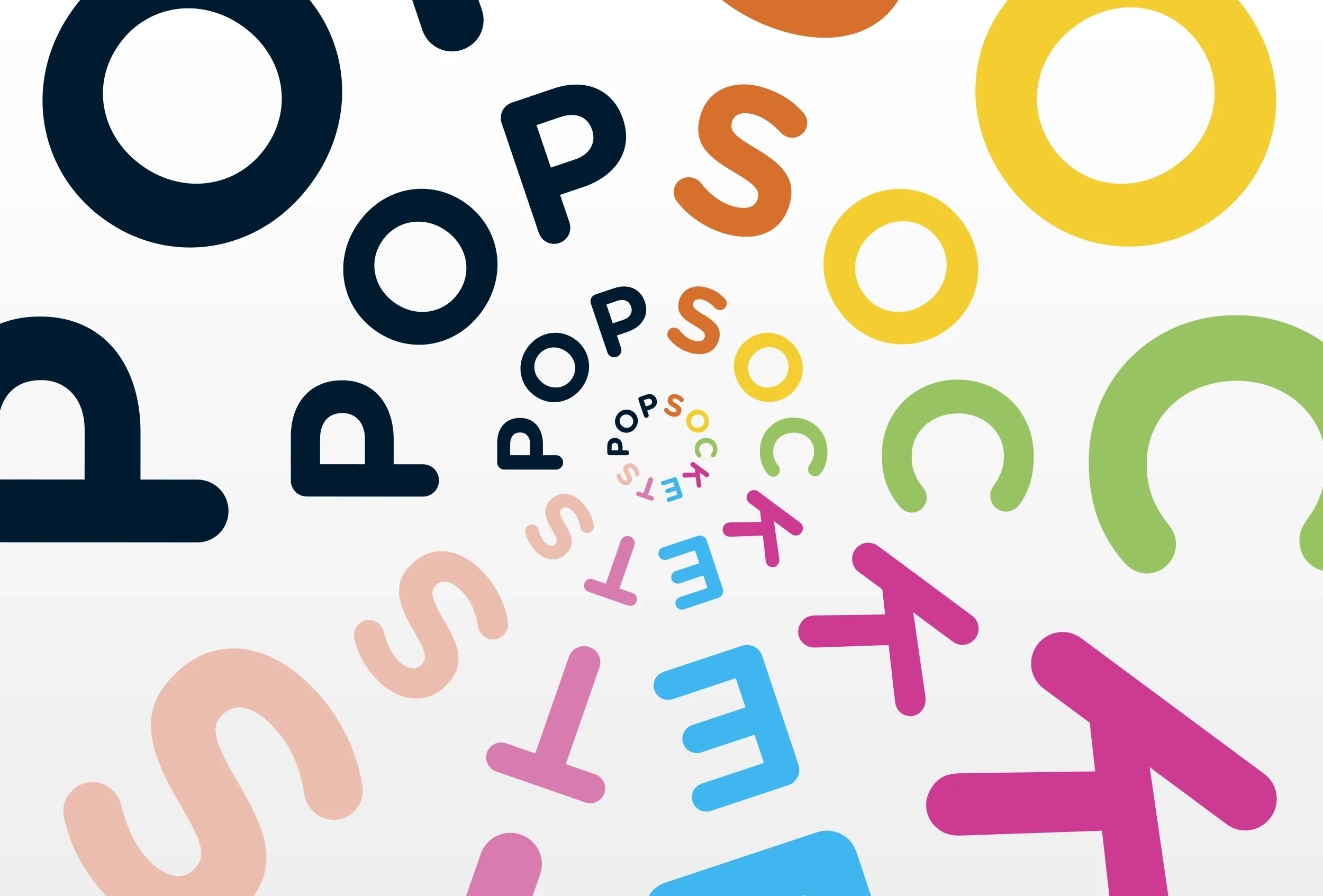
PopSockets Brand Identity
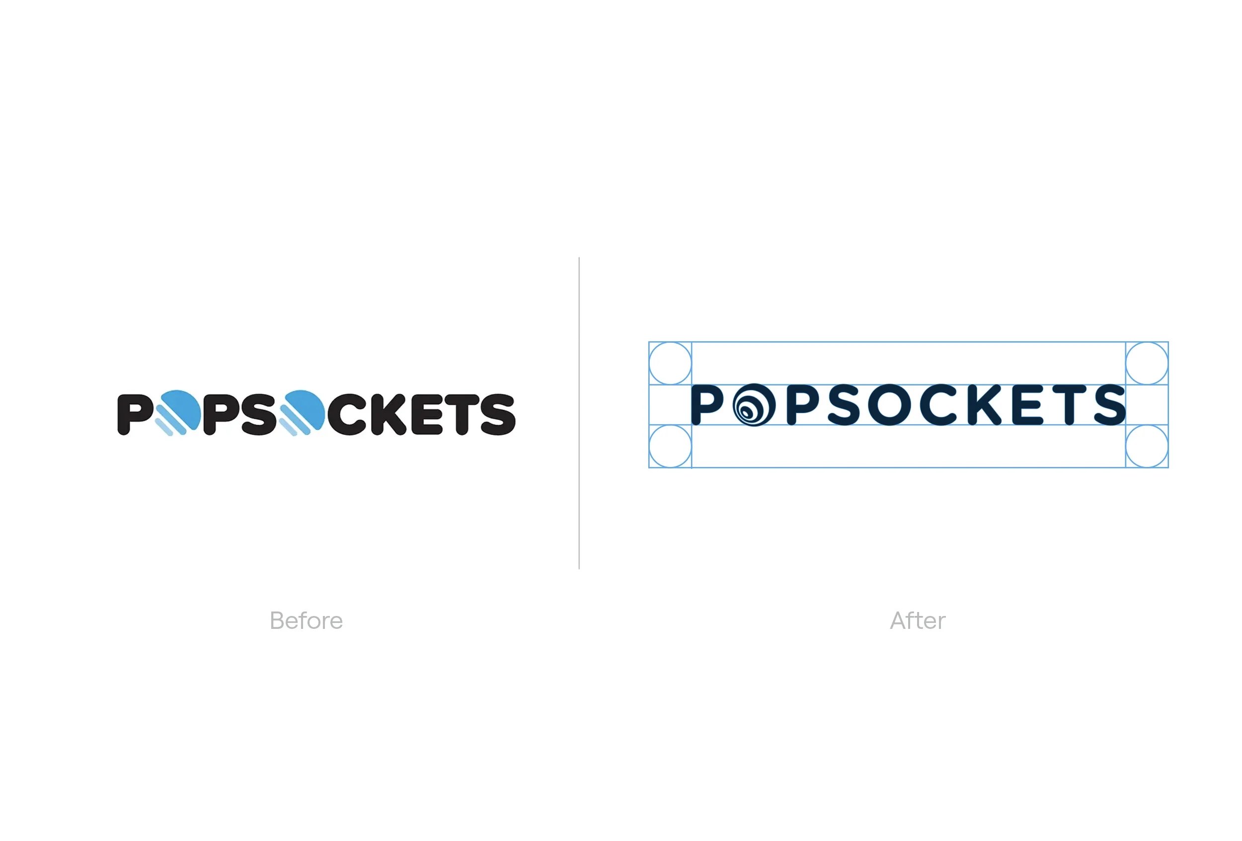
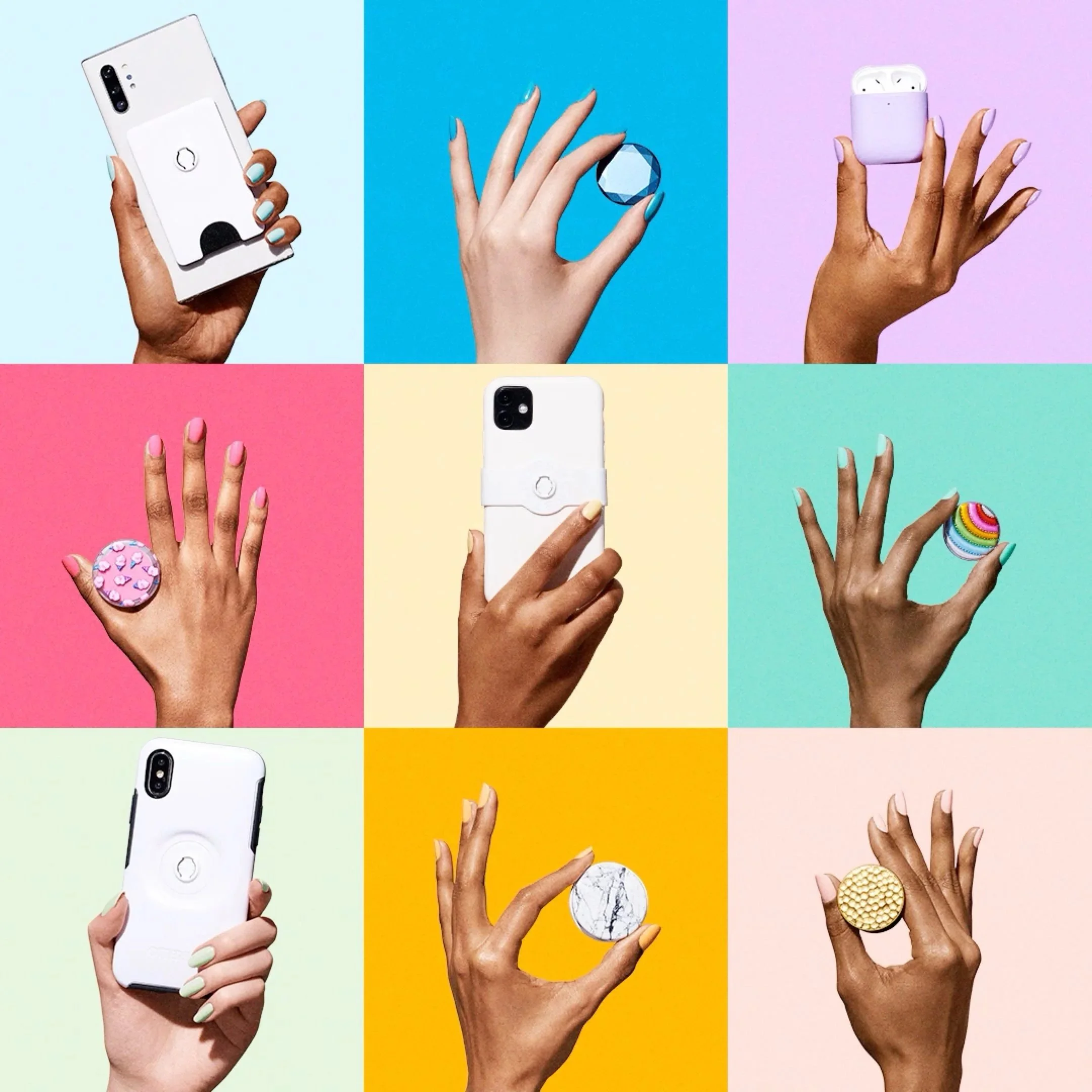
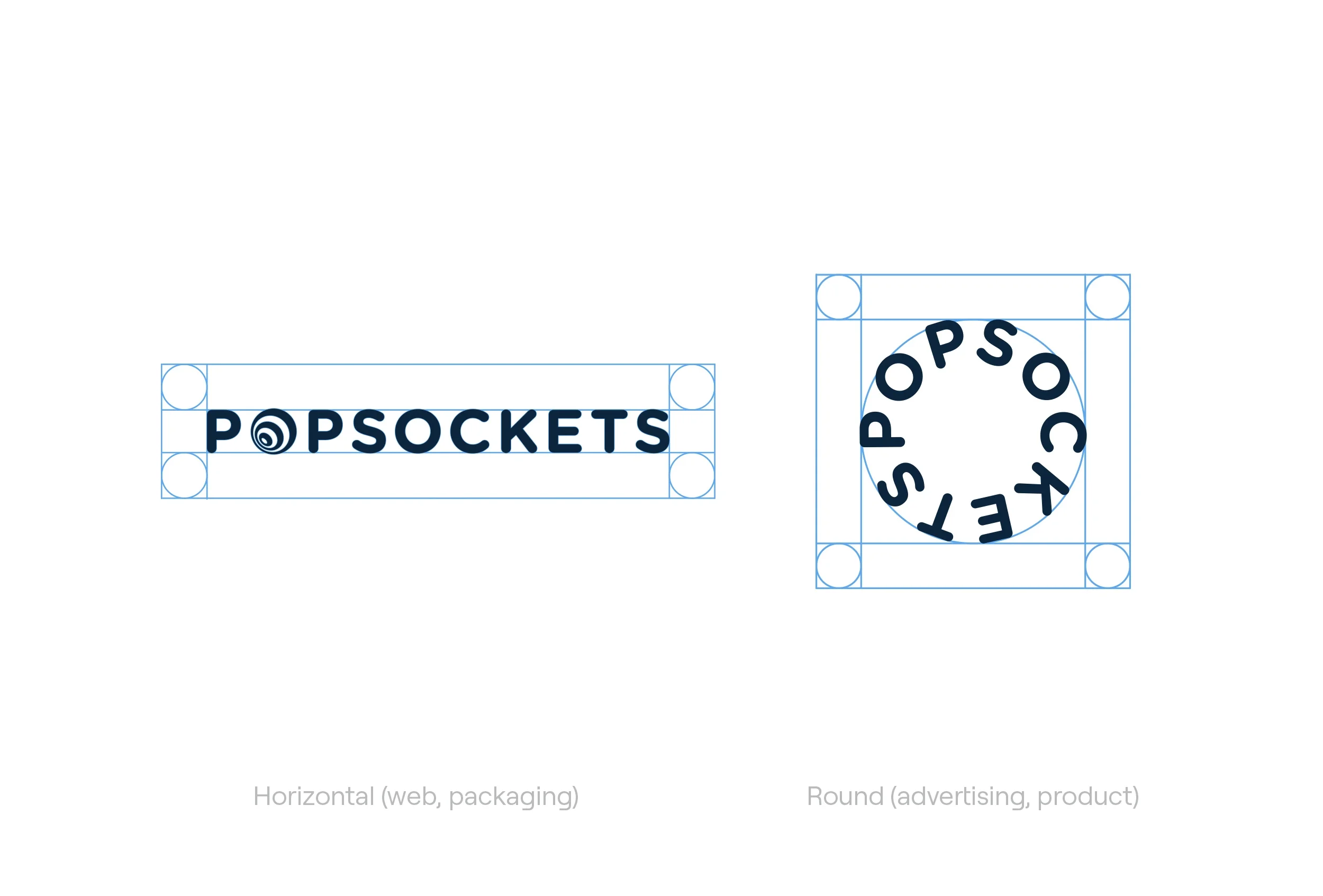
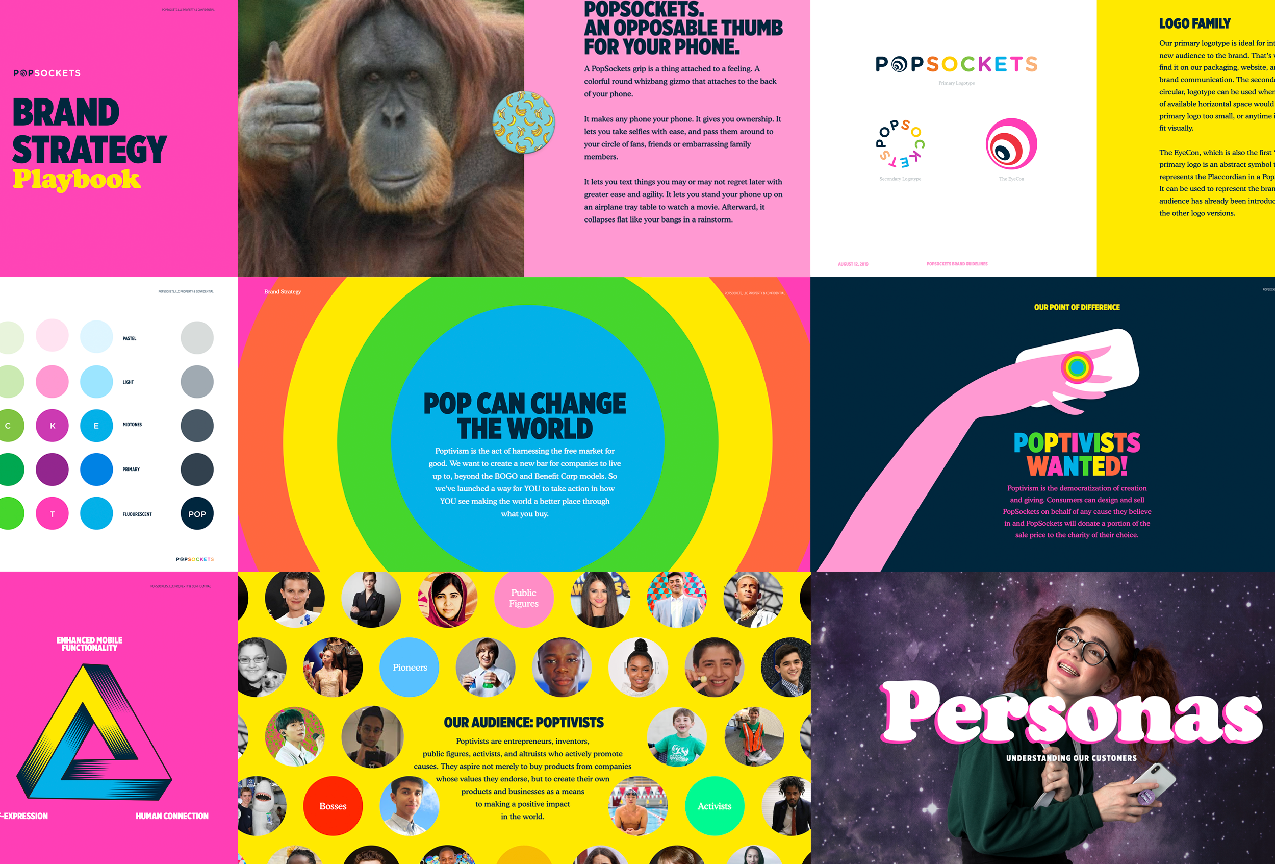
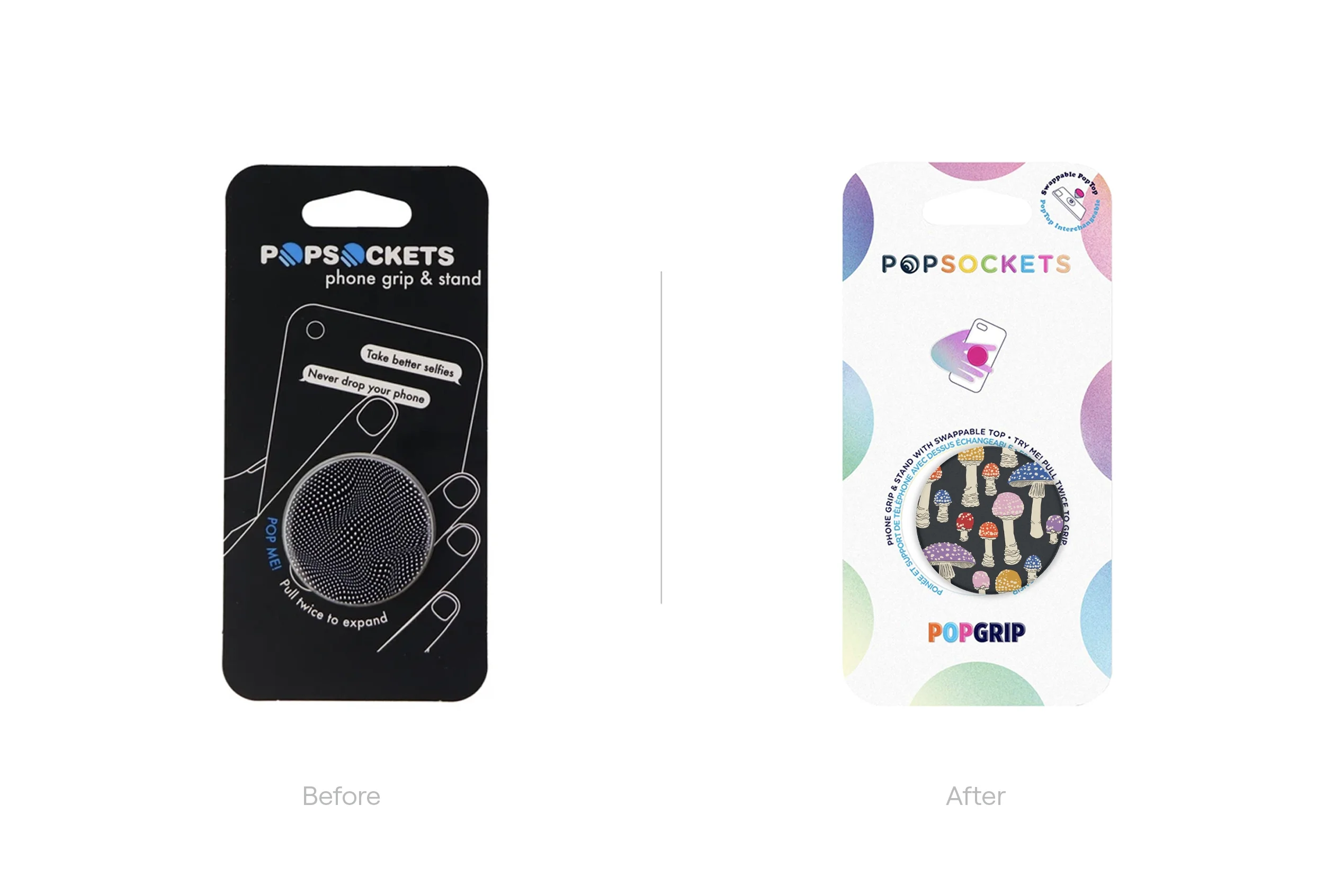
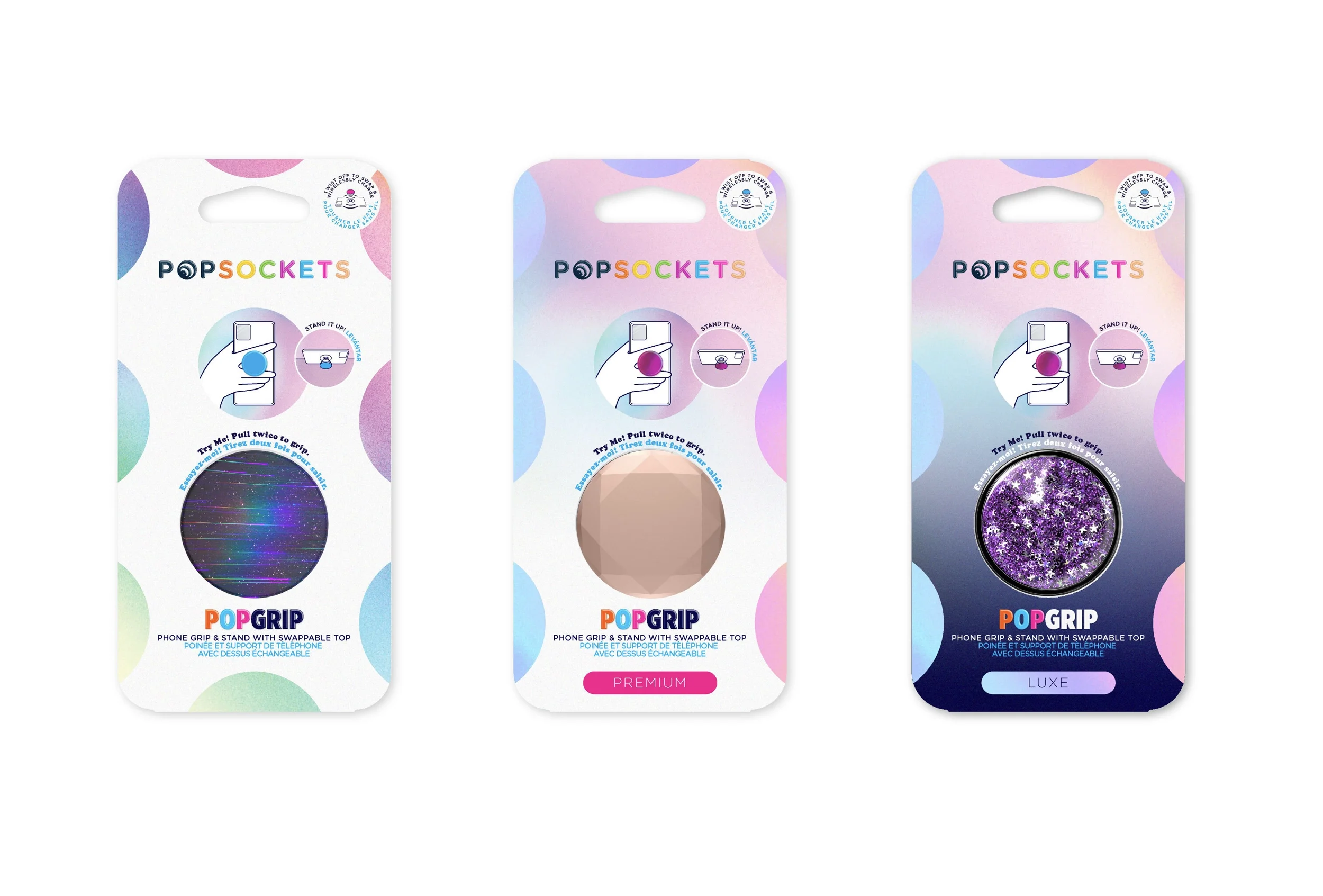
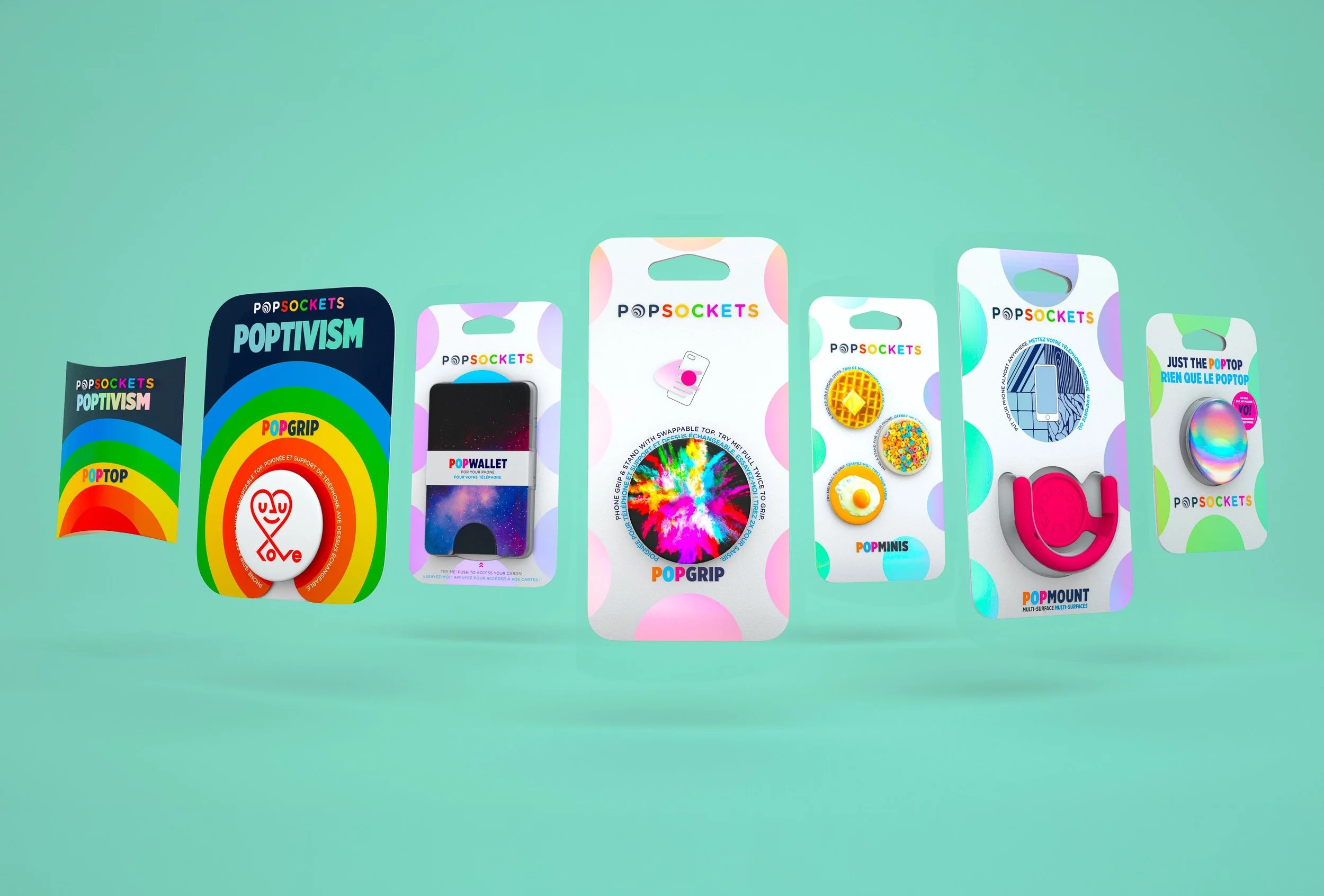
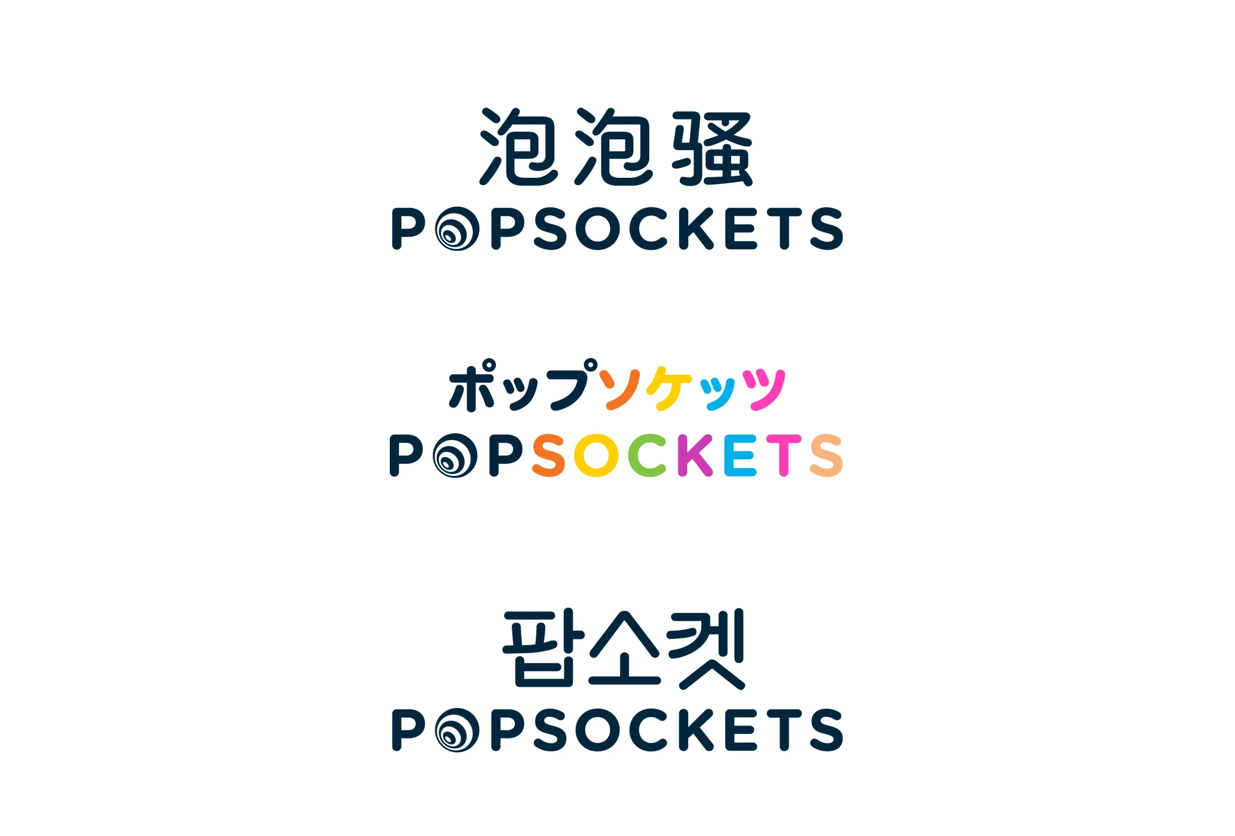
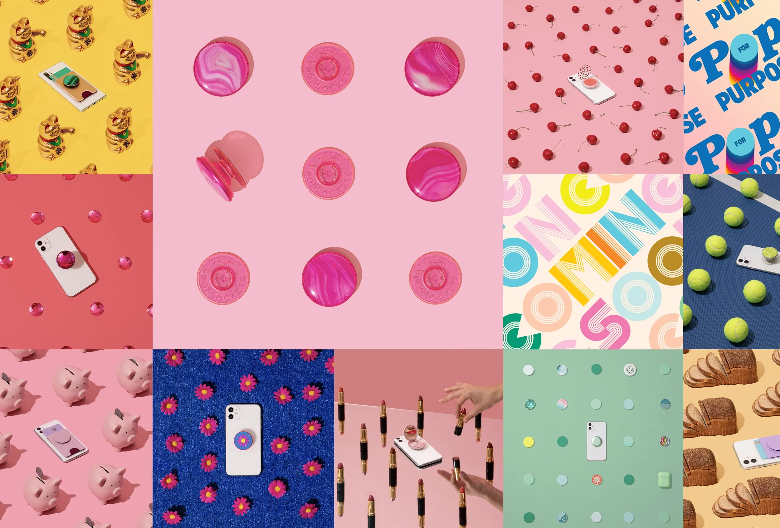
A Rainbow of Pop. PopSockets were invented to solve a problem most of us didn’t even realize we had: smartphones are not designed with hands in mind. Stick a PopSockets grip on the back, however, and you’ve suddenly got something that a human hand can grasp. That’s why we’ve sold more than 240 million of them. PopSockets viral success soon far outpaced it’s existing identity system, and I got called in to help set things right. We created a highly rational, modular identity system, based on the type family Gotham and a rainbow of fruit flavors. The horizontal mark was used for packaging and most digital branding, while the round logotype was reserved for product, social and advertising applications. We also developed native language versions of the mark, with accompanying type families for communications in Japan, China and Korea.










Agency: PopSockets in-house; CMO: Becky Gebhardt; CCO: John Kieselhorst; VP, Brand Design: Justin Fuller; CD: Sonya Ghori, Jess Voight; CW: Brett Shea, Jeff Schuller; AD: Erika Liberato, George Bangs, Swapnil Joshi; Packaging Engineers: Mary LaMacchia, Christina Holmes; Studio: Charlyn Erickson, German Murillo, Ahn Truong; Photography: Jenna Gang, Colors Collective, Angela Kohler, Jimmy Marbles, Joe Friend, Brooks Freehill, Sonya Ghori, Swapnil Joshi; Illustrators: Mike Perry, Craig&Karl, Dan Lehman; Executive Producer: Molly Schaaf, Julie Vosburgh; Producer: Alex Sheridan